

Description
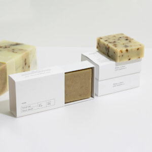
Soap Sleeve Packaging With Debossed Branding For Retail
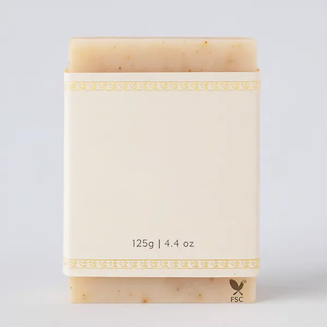
Debossed Soap Sleeves give a clean, pressed-in texture that feels premium without adding visual noise. In the first few seconds, shoppers want the scent name, weight, and ingredients to be easy to find. Soap sleeve packaging should support that quick read. It should also keep the bar looking tidy in photos and on shelves. Debossed soap sleeves wholesale is often used when you want depth that looks calm on both light and dark designs. This style works well for Soap Bar sleeve layouts where branding stays clear and panels stay flat during handling.
Your wrap should match the way customers buy today. A packaging solutions approach keeps Custom soap sleeve packaging consistent across single bars, bundles, and seasonal drops. Debossing helps text and marks look intentional when the layout is simple. It also supports cleaner spacing for ingredients and barcode areas. If you ship often, the sleeve should resist scuffs and keep folds neat. If you sell in-store, it should scan easily and sit straight in stacked displays. This is where Cardboard soap sleeves can also help when extra structure matters.
How Debossing Improves Readability And Touch On Shelves
Debossing presses the design into the material, which creates a shadow and a soft texture you can feel. The branding and printing range category matters because pressure, ink coverage, and alignment all affect how clean that pressed detail looks. A simple rule is to keep the pressed area on bold shapes and clear letterforms. Thin lines can disappear, especially near folds. Leave enough quiet space around the logo and scent name so the detail stands out naturally. This supports user intent because buyers want a fast read, not a crowded wrap.
A common question is “What is debossing used for on a sleeve.” Debossing is used to add texture and depth to branding while keeping the design minimal. The raised texture alternative comparison helps explain the difference: embossing rises outward, debossing presses inward. Both can look premium, but debossing often feels calmer and cleaner. Keep pressed areas away from tight corners so the detail stays even after wrapping. Place ingredients on the back with spacing, and keep barcode zones clear for scanning.
Key points buyers want answered quickly
- What debossing changes on a sleeve
- How the texture holds up during handling
- Where the logo should sit for clean shadows
- How to keep barcode scanning smooth
- Why spacing matters for ingredient readability
Simple steps that keep debossed details clean
- Keep pressed artwork away from fold and glue zones
- Use bold shapes for the pressed brand mark
- Leave quiet margin space around barcode areas
- Avoid heavy ink blocks on sharp folds
- Wrap one sample bar before bulk production
| Focus Area | What It Affects | Best Placement | Practical Tip | Avoid |
|---|---|---|---|---|
| Debossed mark | Texture and shadow | Front center or top | Use bold shapes | Tiny thin text |
| Scent name | Quick recognition | Front center | High contrast | Overcrowding |
| Ingredients | Trust and clarity | Back panel | Add line spacing | Dense blocks |
| Barcode | Smooth scanning | Back lower | Quiet background | Patterns behind code |
| Fit | Shelf neatness | Side seams | Add fold allowance | Tight corners |
Debossed Soap Sleeves Wholesale For Gift Sets UK Range
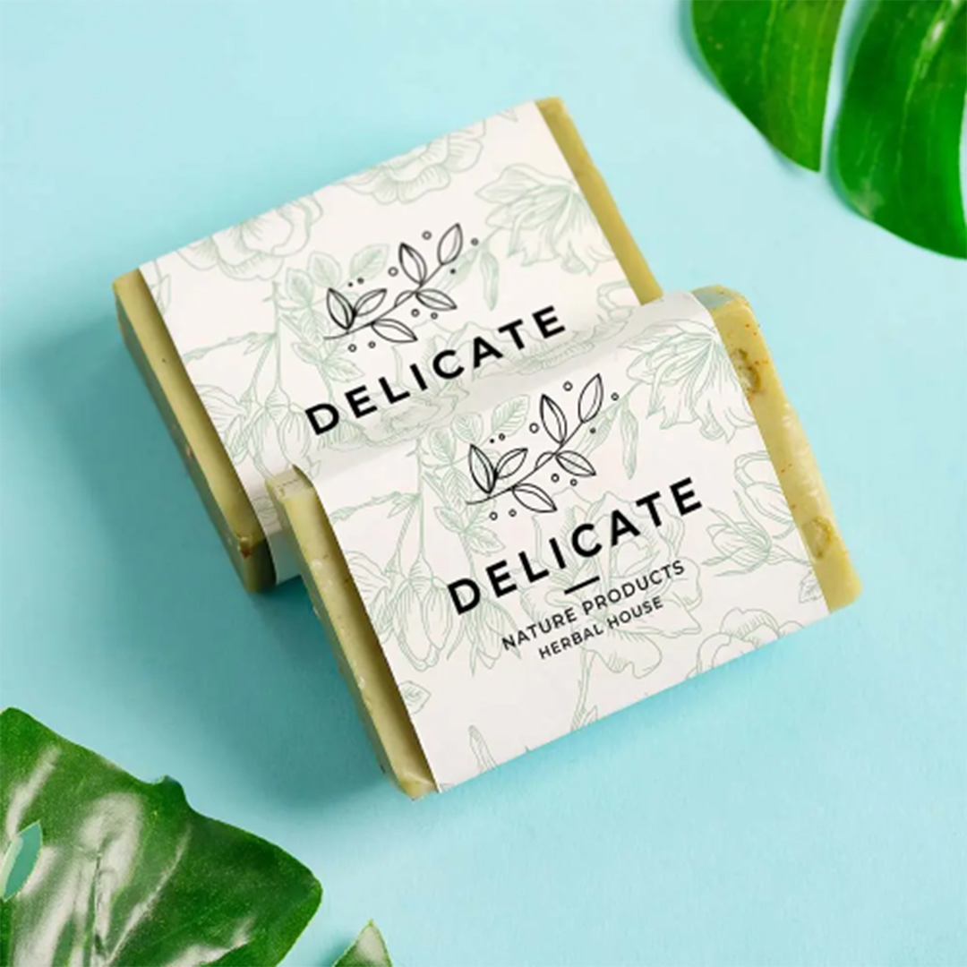
Debossed sleeves work well when you want a premium feel for gift-ready bars without heavy graphics. They help your range look consistent across multiple scents and collections. In gift sets, presentation matters the moment the box opens, and texture helps that first impression. The foil accent options link is useful when buyers ask if shine can be combined with pressed details. Foil can add a small highlight while debossing keeps the layout calm. Keep the focus on one or two areas only, so the sleeve stays readable and does not look busy.
Brand consistency also matters when you sell different formats. The printed branding choices option supports clear logo placement, readable typography, and stable color rules across all variants. That helps when you run both sleeves and Custom soap boxes wholesale for bundles. Keep your logo position, font system, and spacing consistent, then swap only the scent name and a small accent. This reduces design drift over time and keeps your listings and shelves looking like one connected line. It also supports Soap packaging ideas that scale across seasons without starting over.
Choosing Foil And Raised Texture Without Clutter
Foil and debossing can work together, but balance is everything. The luxury packaging wrap option makes sense when you need a premium feel with controlled finishing. Matte backgrounds can keep glare low and allow pressed shadows to show clearly. Gloss can increase brightness in photos, and Spot UV can add a focused shine without coating the whole sleeve. Keep these effects away from barcodes and tight folds so the wrap stays practical for retail handling and shipping.
A calm surface also depends on stock and ink coverage. The rustic kraft wrap choice fits brands that want an earthy look with clean typography. Kraft can hide minor handling marks and still show pressed detail when the debossed area is bold and simple. For readability, use higher-contrast ink on ingredients and warnings, especially on textured surfaces. This supports voice-style buying questions like “How do I keep ingredients readable on kraft sleeves” with a direct answer: increase contrast, add spacing, and keep the layout uncluttered.
Common questions shoppers ask in simple words
- What is the difference between debossing and foil
- Will pressed texture rub off during shipping
- Which finish keeps glare low in photos
- Can kraft still hold readable ingredient text
- How to keep gift sets looking consistent
Steps for a clean premium sleeve layout
- Keep foil limited to a small brand mark area
- Place debossing on bold logo shapes, not thin text
- Keep ingredient text spaced on the back panel
- Leave quiet space around barcode and batch code
- Select Matte, Gloss, or Spot UV based on photo needs
| Design Choice | Visual Result | Touch Result | Best Use | Keep In Mind |
|---|---|---|---|---|
| Deboss only | Calm depth | Pressed texture | Minimal brands | Needs spacing |
| Foil only | Bright highlight | Smooth shine | Gift accents | Can glare |
| Deboss plus foil | Premium focus | Mixed texture | Logo emphasis | Avoid clutter |
| Kraft with deboss | Natural feel | Soft pressed shadow | Earthy lines | Use contrast |
| Matte base finish | Low glare | Smooth feel | Online photos | Helps readability |
Materials And Fit For Debossed Sleeve Production
Material choice affects how clean the pressed detail looks once the sleeve is wrapped and handled. A sleeve that feels too soft may show less defined shadows, while very stiff stocks can crack if ink coverage is heavy on folds. Getting the fit right is just as important. The custom dimensions option supports clean slide-on wrapping and helps keep panels flat for retail. Measure width, height, and depth, then add a small allowance for fold space so corners do not tear. This also helps keep debossed marks even, because tight corners can distort the pressed area.
Some teams test fit before committing to full effects, especially when bar sizes vary slightly across batches. The plain sleeve version approach helps confirm fold behavior, wrapping speed, and barcode placement without waiting for full runs. This is useful for Blank soap sleeves testing, and it supports clean workflow when you want to avoid waste. Once the fit is confirmed, you can move into full debossing and finishing choices without changing the dieline. This supports Custom soap sleeve packaging that scales, whether you pack daily or run seasonal drops.
Sizing Steps That Prevent Twists And Corner Tears
A sleeve looks premium when it sits straight and stays tight enough to avoid twisting, without being so tight that corners split. The sleeve style options category helps match the structure to your bar shape, whether it is square, rectangular, or slightly beveled. For angled bars, add a touch more allowance and keep key text away from edges. Keep the barcode zone flat and quiet so scanners read quickly. This supports user intent because buyers and store staff want smooth scanning and clear information without extra handling.
Soap wrapping paper and sleeve stocks also affect how the product feels in hand. If you need more structure, Cardboard soap sleeves can help with stacking and shipping. If you want a natural look, Kraft Soap Bands can support an earthy tone when typography and spacing stay clean. Soap packaging ideas work best when they are consistent across the whole range. Keep the front panel simple, keep the back panel readable, and keep the pressed detail on bold marks only. Then the sleeve looks calm in photos and still feels premium when touched.
Practical checks that keep the sleeve neat
- Fit is snug without stressing corners
- Pressed logo stays off tight folds
- Ingredients are spaced and readable
- Barcode margin is clear and quiet
- Panels stay flat in stacked displays
Order steps that keep production smooth
- Share bar size and shape details clearly
- Confirm the dieline and fold zones early
- Choose Matte, Gloss, or Spot UV based on usage
- Approve one wrapped sample at real size
- Finalize quantity, timing, and delivery details
| Production Focus | What To Confirm | Simple Adjustment | Result | Helps With |
|---|---|---|---|---|
| Fit | Sleeve twisting | Add allowance | Straighter panels | Shelf look |
| Corners | Small tears | Reduce tightness | Cleaner edges | Shipping |
| Deboss clarity | Soft shadows | Use bolder mark | Cleaner texture | Branding |
| Ingredients | Hard to scan | Add spacing | Faster reading | Trust |
| Barcode | Scan issues | Quiet margin | Smooth checkout | Retail |